
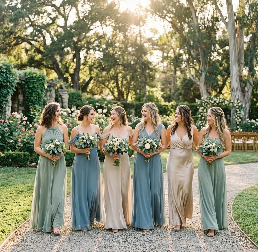
Most advice about bridesmaid colors starts with the bridesmaids. A better starting point is the room, or the field, or the stretch of sand. A color never appears on its own. It appears against stone, grass, polished wood, a white tent, or a wall of candles, and that backdrop can make the same dress glow or go flat.
This guide works from the outside in. It looks first at what each season offers, then at how six common venue types change the way color behaves, then at day and evening light, neutrals, skin tones, the bride’s own dress, and a simple way to test a shade before ordering six of them.
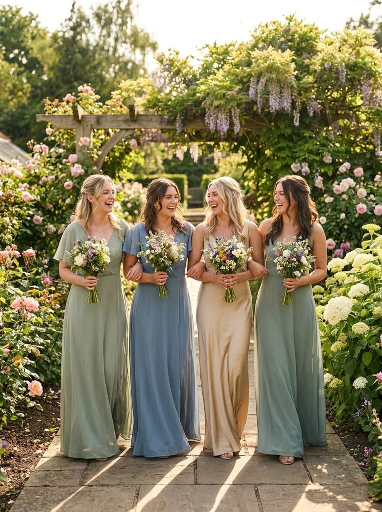
Start by Looking at the Venue, Not the Swatch Book
A color chart shows shades in neutral light on a white background. A venue has none of that. Before browsing swatches, spend a few minutes studying the place where everyone will stand.
Note the fixed colors first: floors, walls, drapes, ceiling beams, hedges, and the color of the building behind the ceremony spot. Then look at the light, including which direction it comes from at the hour of the ceremony, whether trees or awnings cast shade, and how bright the indoor lamps are after dark.
A few questions help turn those observations into a shortlist:
- Does the space lean warm (wood, brick, candlelight) or cool (white walls, glass, grey stone)?
- Is it already full of color, such as floral wallpaper or colorful tile, or is it a quiet blank canvas?
- Will most photographs happen outside or inside?
- What color is the greenery, and does it look yellow-green or blue-green?
Photographs help. Ask the venue for pictures taken during the same season and hour as the wedding, or visit around that time. Azazie’s color guide recommends testing shades in the venue’s own lighting before ordering, and that habit prevents most color regrets.
Spring: Colors That Borrow From New Growth
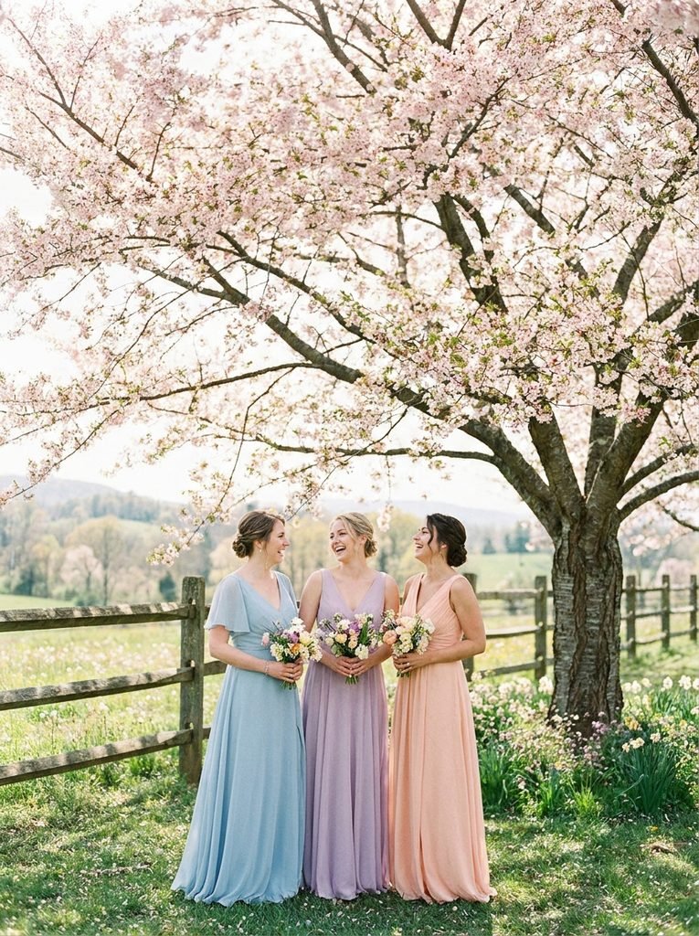
Spring palettes tend to draw on young leaves, early flowers, and pale skies. Soft sage, powder blue, lilac, pale peach, butter yellow, and blush feel natural in this season because the surroundings are already fresh and light.
There is a catch with pastels. Under bright midday sun, very pale shades can lose definition and look washed out in photographs, especially against white buildings or overcast skies. A slightly deeper version of the same color usually reads better. Dusty blue holds its shape more clearly than baby blue, and a muted lilac stands out more than a barely-there lavender.
Champagne and soft taupe also work for spring when a bride prefers a neutral base. They look especially good next to loose, green-heavy bouquets because they let the flowers carry the color.
Summer: Heat, Glare, and Color That Holds Up
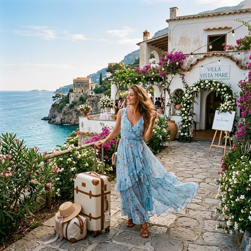
Summer brings strong light, saturated greens, and long outdoor hours. Colors that look pleasant at a showroom can fade in direct sun, so mid-depth shades often perform best. Terracotta, apricot, cornflower, deep coral, soft mustard, and clear sea blue all stand out without looking harsh.
Dark colors can work in summer, too. Pronovias suggests that dark shades in a summer wedding bring unexpected contrast and elegance when paired with lightweight fabrics and fluid shapes. A navy chiffon or an emerald crepe can look striking against bright flowers, although very dark colors can feel warmer to wear in strong heat, so fabric weight matters as much as the shade.
Light-colored satin and very sheer pale chiffon deserve a second look in summer. They can show perspiration and become see-through in bright sun, so a fully lined dress in a slightly deeper color is safer.
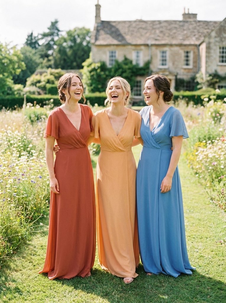
Autumn: Rust, Olive, and Plum
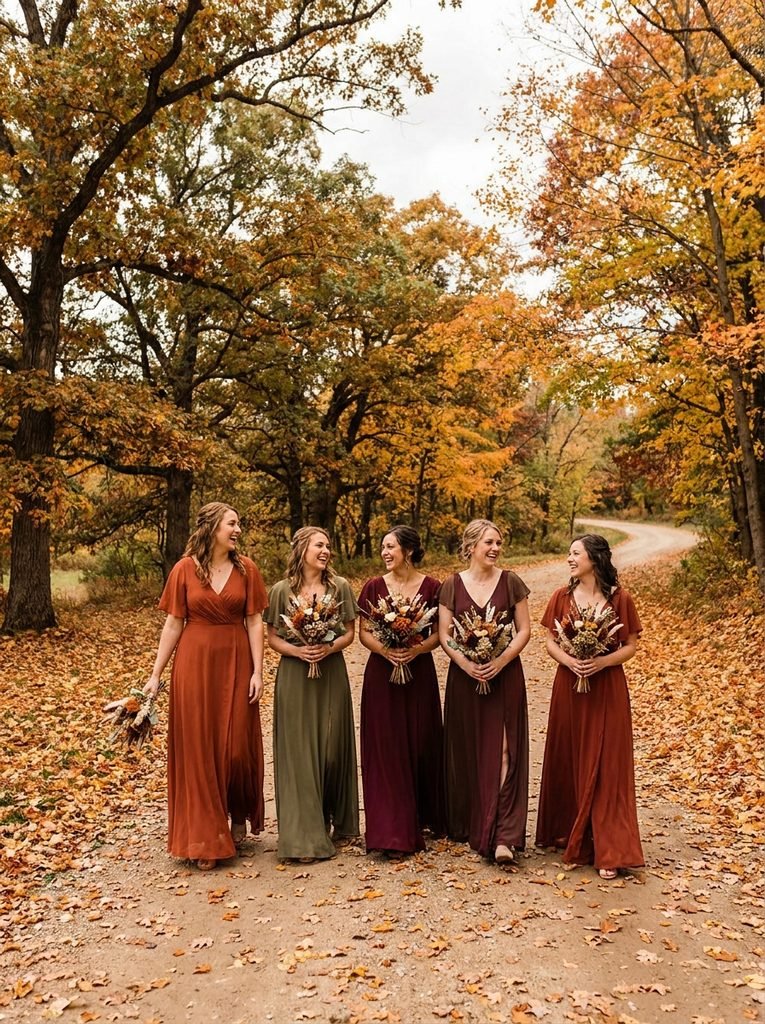
Autumn is the season when a color palette practically chooses itself. Rust, burnt orange, olive, burgundy, deep teal, mustard, chocolate brown, and plum all echo the changing landscape and glow in low golden light.
One thing to watch is matching the leaves too closely. If the ceremony site is surrounded by orange foliage, an orange dress can blend in. A contrasting shade, such as deep teal or dusty plum against orange leaves, makes bridesmaids stand out while still feeling seasonal.
Autumn also suits mixed palettes. Rust, olive, and burgundy sit comfortably together, so a bride can offer three shades within the same warm family and still get a cohesive group photograph. Fabrics such as velvet, crepe, and matte satin hold deep color well and add richness in cooler weather.
Winter: Jewel Tones and Quiet Neutrals
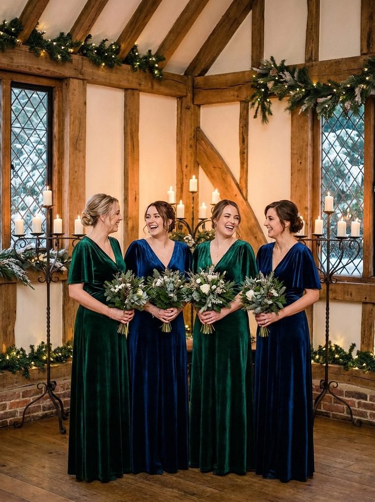
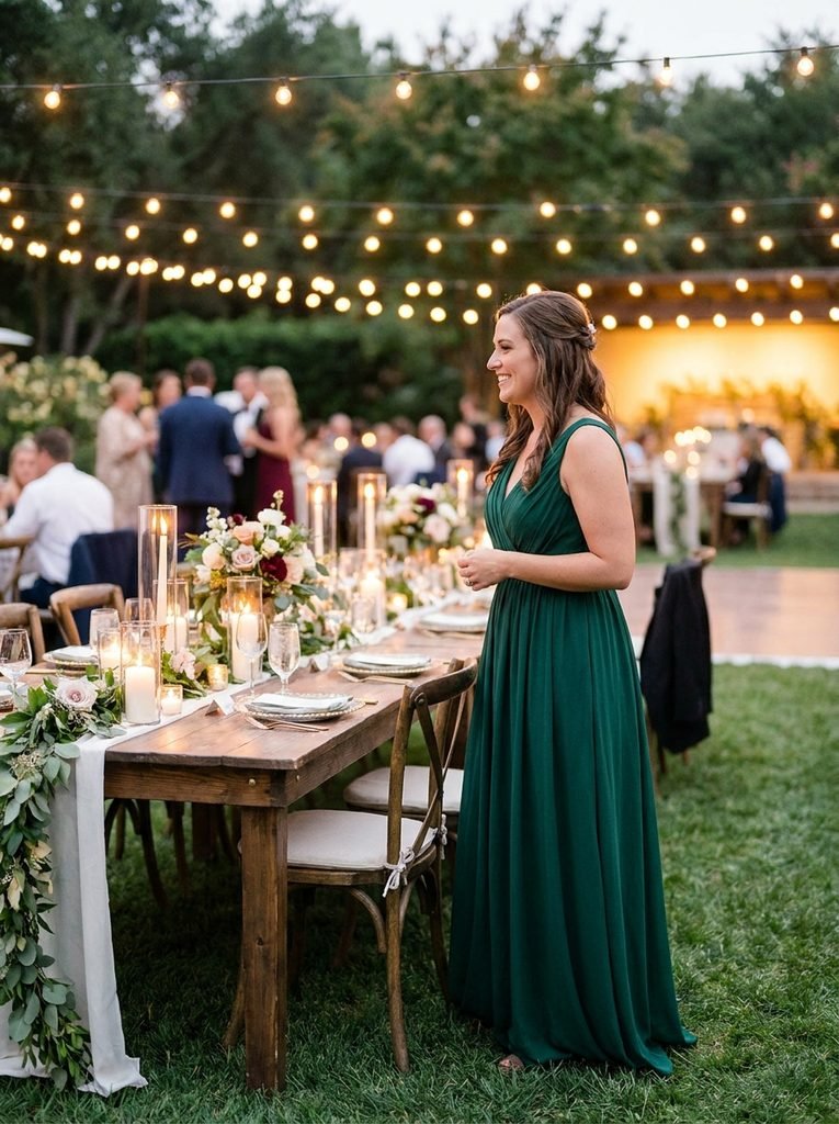
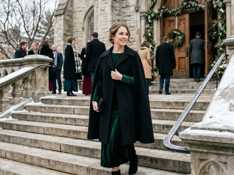
Winter weddings are often indoors or in short daylight, and deep colors look best in that setting. Emerald, sapphire, burgundy, plum, forest green, and deep navy gain depth under candlelight and warm lamps. Velvet absorbs light and gives these shades a luxurious look.
For a softer winter look, silver-grey, champagne, pale dove, and icy blue pair well with snowy backdrops. Charcoal and black can feel modern and sharp, particularly with white or ivory flowers.
A winter wedding outdoors needs a bit more planning. Dark dresses look striking against snow, but they also need coverage such as wraps or jackets in a matching tone. The site’s guide to winter wedding outfit ideas shows how coverage and color work together in cold-weather ceremonies.
Matching Color to the Venue
Season sets the mood, but venue decides what really looks good. These six types cover most settings.
Gardens and Vineyards
Natural settings are already rich in green, so colors that complement it work well. Dusty rose, soft terracotta, lilac, and warm champagne stand out against foliage without competing. Avoid mid-green dresses against green hedges, since they can blur into the background.
Beaches and Coastal Venues
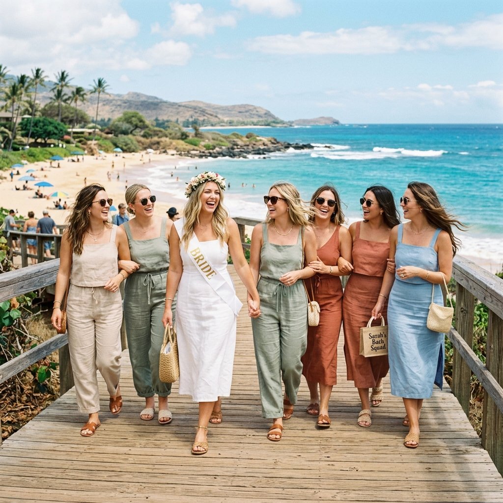
Sand, sky, and sea create a bright, open backdrop. Soft blues, seafoam, coral, sand, and pale gold feel natural. Very white shades can disappear against bright sand, while deeper shades such as navy and teal stand out clearly. Strong wind makes lightweight fabrics practical.
Barns and Rustic Venues
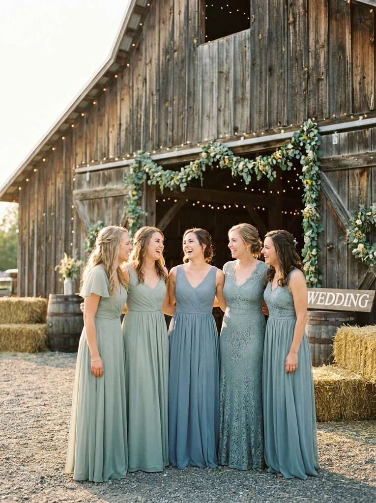
Wood, hay bales, and exposed beams provide warm, earthy tones. Sage, dusty blue, burgundy, mustard, and deep forest green all feel at home. Rich, slightly muted shades suit these spaces better than bright neon colors, which look out of place.
Ballrooms and Hotels
Formal indoor spaces usually have neutral walls and strong chandeliers, so jewel tones and metallic shades perform well. Emerald, sapphire, burgundy, deep navy, and champagne look polished, and satin or crepe adds subtle sheen. Because of the warm lighting, cool shades can look slightly flatter, which makes it worth testing in the actual room.
Historic Buildings, Churches, and Stone Venues
Stone and old wood can feel dark inside, so mid-tone and slightly lighter shades help bridesmaids stand out. Dusty blue, soft sage, warm taupe, and muted mauve look elegant in these settings. Very dark colors may disappear against dim interiors.
Modern Lofts and Industrial Spaces
Concrete, brick, and steel suit clean, confident shades. Deep olive, terracotta, charcoal, mustard, and black look sharp against hard surfaces, while soft blush adds a gentle contrast. Minimal fabrics such as crepe and satin reflect the architectural feel.
Day or Night: How Light Changes the Same Dress
A single dress can look like two different colors depending on the hour. Morning light is cool and clear, so pastels look crisp. Late afternoon light is warm and golden, which enriches terracotta, rust, and champagne. After sunset, candlelight and string lights shift everything warmer and darker, so saturated shades such as emerald and burgundy look best.
If the ceremony is in the afternoon and the reception continues into the evening, mid-depth shades tend to hold up across both. The site’s guide to day versus night wedding outfits explains light in more detail from the guest’s point of view, and the same principles apply to the bridal party.
Metallics and Neutrals as Safe Ground
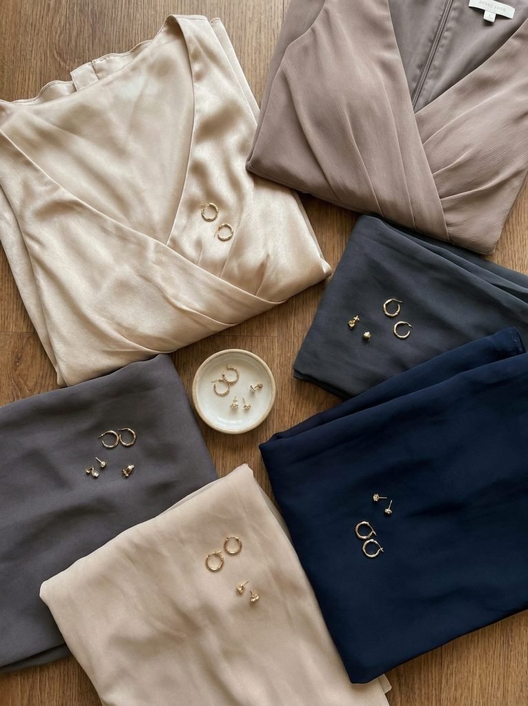
When a venue is colorful or a palette is still undecided, neutrals provide a reliable base. Champagne, taupe, soft grey, black, and navy rarely clash with flowers, décor, or the bride’s dress.
Metallic shades such as gold, bronze, and silver work well for evening and winter weddings, particularly in sequins or satin. They catch light and add sparkle without requiring a strong color. One caution is that very reflective sequins can bounce flash in photographs, so a matte or subtle shimmer fabric is often more flattering.
Choosing a Shade That Works for Several Skin Tones and Hair Colors
A bridal party usually includes a range of complexions and hair colors, and no single shade looks identical on everyone. A few approaches make this easier. These are styling observations, not rules.
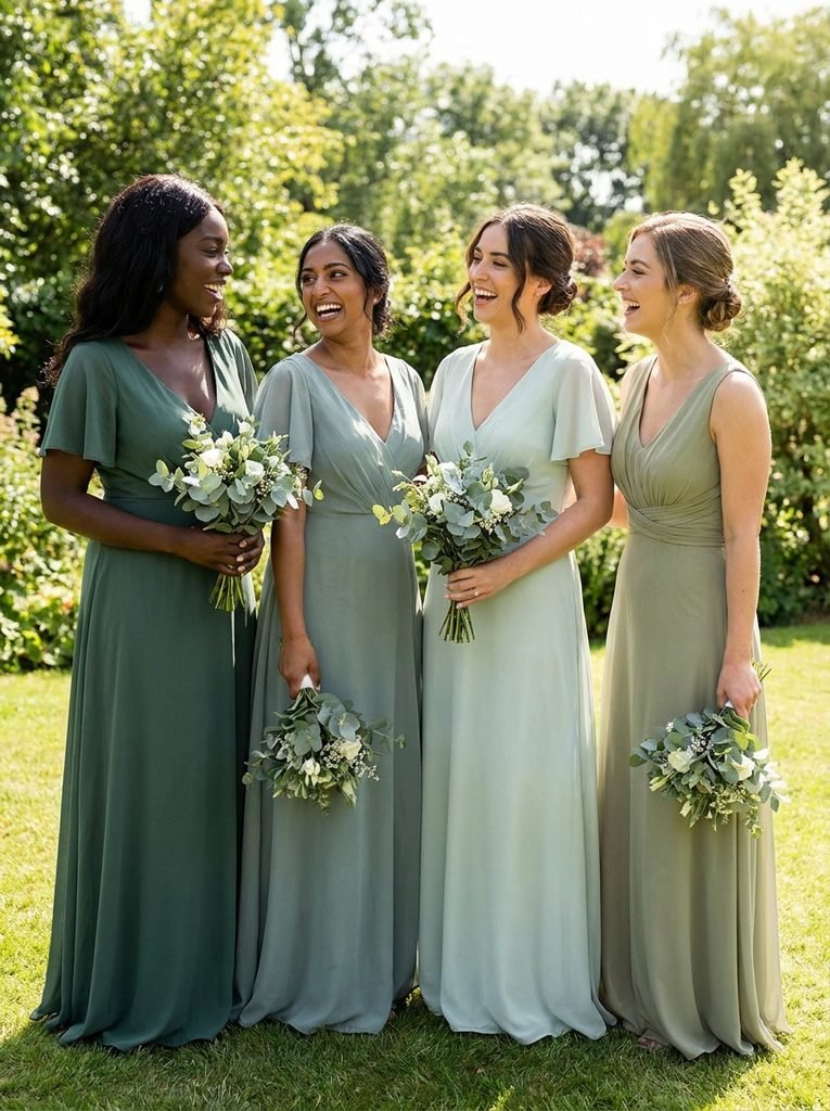
Mid-depth, slightly muted shades tend to suit the widest range. Very pale pastels and very bright neons are more likely to look uneven across a group.
Offering two or three shades from the same family, such as three tones of green or a trio of warm earth colors, lets each bridesmaid choose the one she feels best in while keeping the group cohesive.
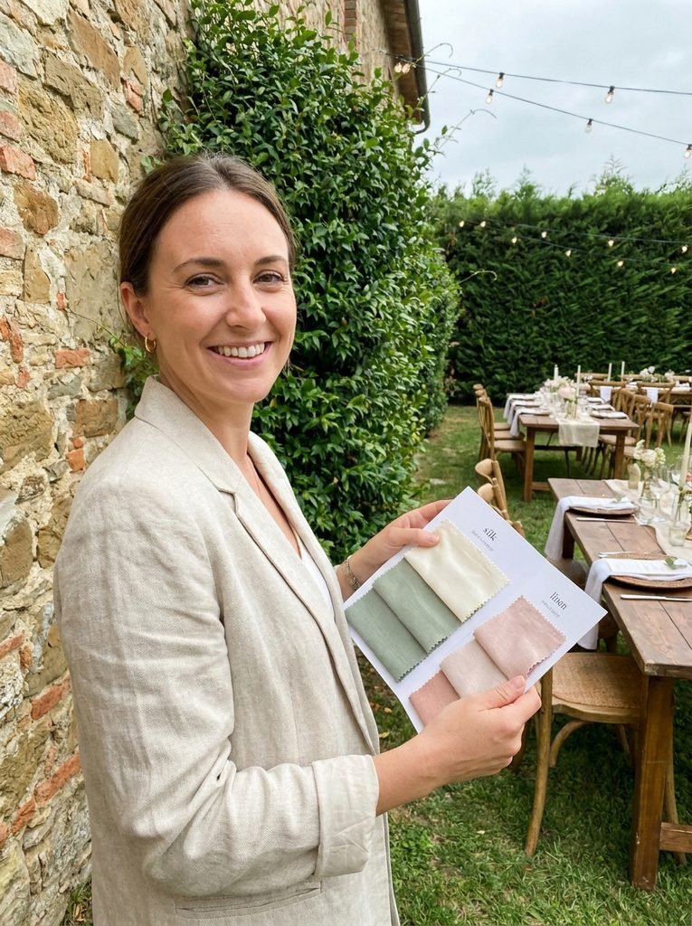
Finally, comparing swatches next to each bridesmaid’s face in daylight is more useful than judging from a screen. If the bride also wants the group to choose their own shapes, the guide to bridesmaid dresses that flatter every body type covers silhouette decisions, and the guide to mismatched dress codes shows how to give open instructions clearly.
Working Around the Bride’s Dress and Flowers
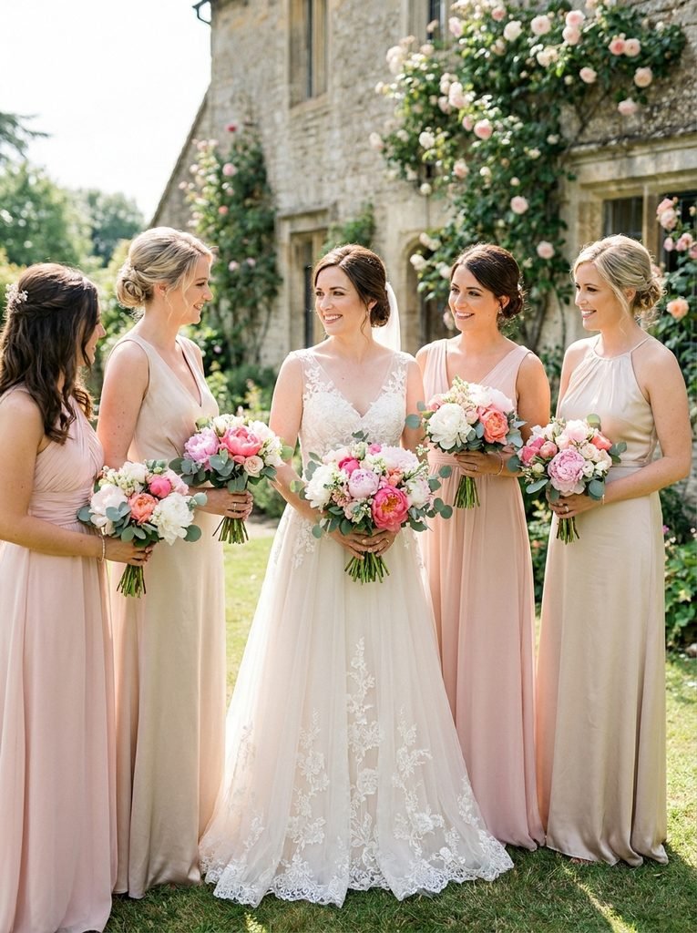
The bride’s dress is the anchor, so bridesmaid colors should sit comfortably beside it. Bright white, soft ivory, and warm champagne have different undertones. Cool, crisp white pairs naturally with blues, greys, and silvers, while ivory and champagne look lovely with blush, sage, gold, and terracotta. Placing a swatch next to a fabric sample of the gown quickly reveals whether the two clash.
Flowers need the same attention. A bouquet can echo the dress color or provide contrast. Soft pink peonies with sage dresses look gentle and natural. Burgundy dahlias against champagne dresses feel rich and layered. If the bouquets already carry strong color, quieter dresses may look better, while neutral bouquets give bridesmaids room to wear bolder shades.
A Simple Test Before You Commit
Ordering half a dozen dresses in a color that has only been seen on a screen is risky. A few quick steps reduce that risk:
- Order swatches or a single sample dress and view it at the venue, at the same time of day as the ceremony
- Take a photo in black and white to check that the shade has enough contrast with the background
- Place the sample next to the bride’s dress fabric and a few flowers
- Stand the bridesmaids together, if possible, and take a group photo to see how the shades work as a set
- Check the color again in indoor lamplight if the reception is in the evening
It also helps to order a little early. A window of six to eight months before the wedding leaves time for exchanges and alterations, and it avoids the problem of a discontinued shade.

Quick Answers Before You Choose
Do bridesmaid colors have to follow the season?
Not strictly. Seasonal colors are a good starting point, but the venue and the bride’s taste matter just as much. A deep jewel tone can look beautiful at a summer evening wedding.
What color is safest for mixed skin tones?
Mid-depth, slightly muted shades such as dusty blue, sage, terracotta, and warm champagne tend to work for many people. Testing swatches beside each bridesmaid is the most reliable check.
Can bridesmaids wear white or ivory?
Most brides prefer to keep white and ivory for themselves, so champagne and other soft neutrals are the usual alternatives. It is worth confirming with the bride.
Should the dress color match the bouquet?
It can, but it does not have to. Echoing one color from the bouquet gives a cohesive look, while a contrasting bouquet adds depth.
How many colors can a bridal party wear?
One to three related shades usually work well. More than that can look busy unless the palette is carefully planned.
Let the Setting Do Half the Work
The best bridesmaid color is rarely the most unusual one. It is the shade that looks like it belongs in the place where everyone is standing, at the time of day when the photographs are taken. Look at the venue, think about the light, check the bride’s gown and bouquet, and test a swatch before ordering.
Once the color feels right in the setting, the rest of the planning, from silhouettes to shoes, becomes much easier.

Leave a Reply